Low-fidelity prototype
Having decided on the key idea and core features of prototypes 1 and 2, we decided to split up our group of 6 into two groups 3 in order spread the workload. The two prototypes thus had very little influence on each other. This strategy appeared effective enough given the time constraints and effort involved in prototyping, although we cannot claim it superior to another strategy, since it is the only we one we used. Going forward (when choosing a single product to develop further), it is possible that the group members of the "chosen" prototype will feel more emotional ownership of the product. However, we do not foresee this becoming a significant issue, as the ideation process involved all members equally and we have demonstrated excellent communication and teamwork skills throughout this project. In the following, the two groups will reflect separately on the process of creating each prototype.
Prototype 1
For our Prototype we started to design the different study modes. We decided to implement three different modes which are: Professor, Student and Detective. From our ideas we had a rough idea which mode should do what and wrote the features to the specific modes.
We decided to use Figma to implement our prototype as it was recommended and it looked like the ideal tool to create a LoFi-prototype. It was our first time using Figma, but we quickly built some UI screens on got a rough layout as seen in the screenshot. On of our highlights of this prototype is the mascot that guides you through your study session. We decided to go with an owl and generated a few versions with AI. After some more work we already had our first study mode, the Professor Owl Mode. Everything worked well and we soon had our next meeting to discuss the progress.
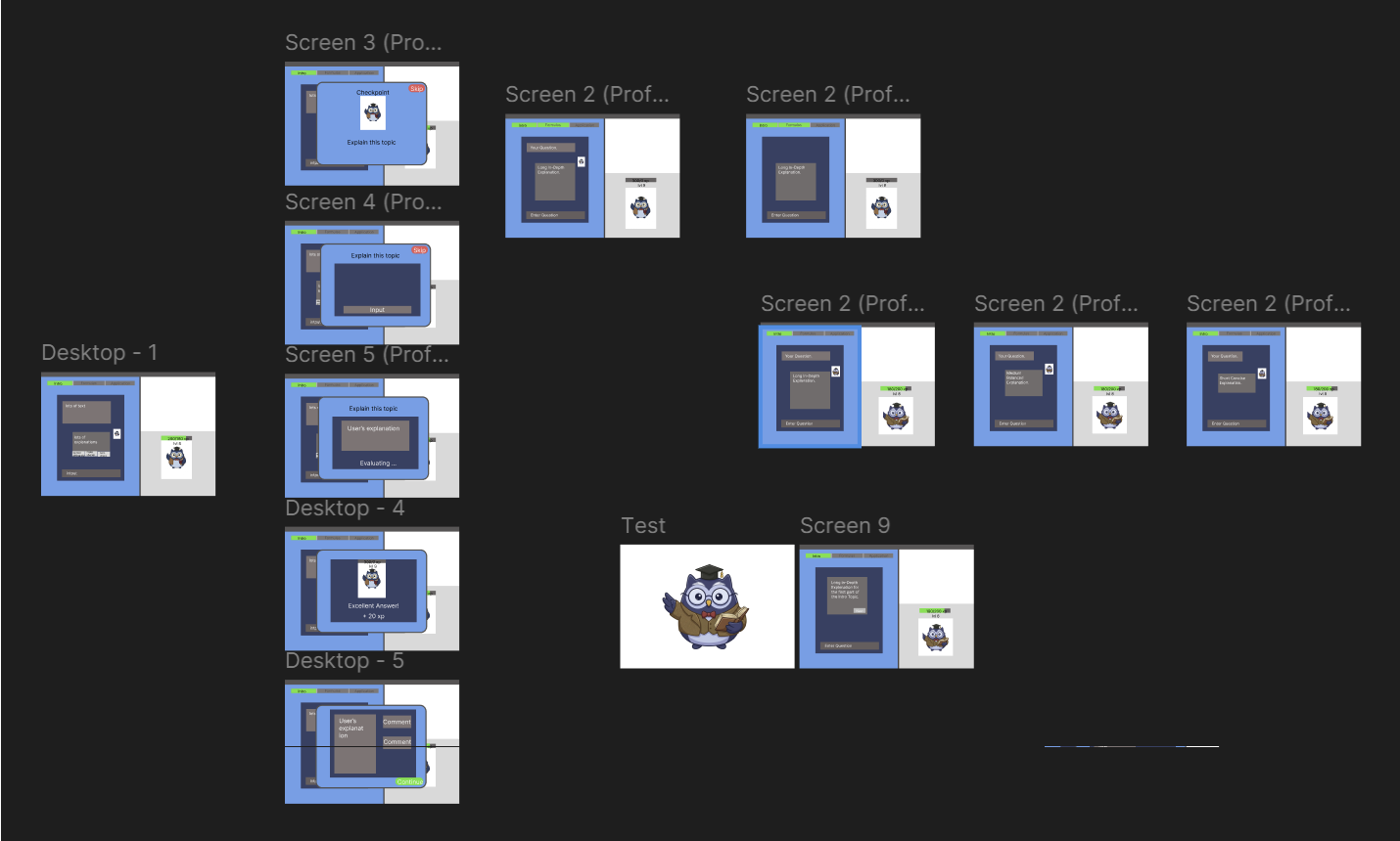
It turned out that after the ideation we all had a rough idea what each mode should do but unfortunately those ideas no longer matched with each other. On top of that we had some features that were implemented but didn’t make sense to everyone. It was a catastrophe, but we didn’t give up. We sat together and now clearly defined which mode gets which features and what modes even make sense and are not already included in another one. In the end we decided that the Professor Owl Mode should guide the user through an uploaded script, the Student Owl Mode should question and test the user in learning sessions, and the Detective Owl Mode should guide the user through an uploaded assignment. It was a little careless that we didn’t clearly discuss the different modes before, but some unexpected mistakes always happen.
We now had the new ideas but still had to implement them. Luckly, the UI didn’t need much change, and we were able to reuse most of the logic. We first remade the Professor Owl Mode and had to change the interaction such that the Professor Owl starts with the conversation unlike in a normal AI chat. After many Figma slides later we finished the most important mode and implemented the other two. While implementing the transition between the Figma slide we often felt the inexperience with Figma but still tried our best to make it as interactable as possible. Thus, creating a state diagram (seen in the screenshot) with lots of Figma slides but also some dynamic variables. There were many problems with the dynamic picture of the Owl that needed to change but in the end everything worked. After connection the last few transitions we were done and were satisfied with our product.
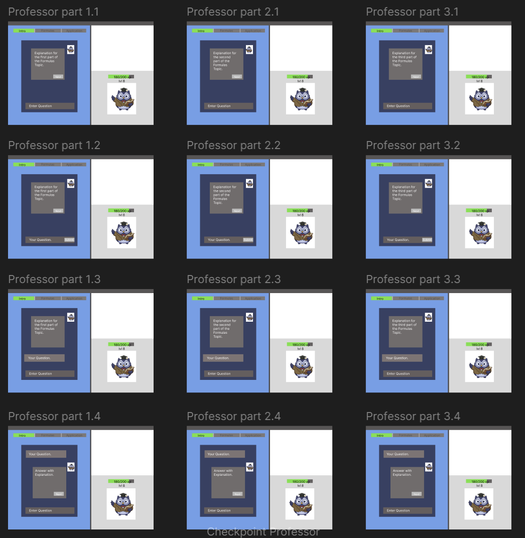
Overall, we had our ups and downs and now more experience in building a LoFi prototype. If we could do the prototype again, we would definitely start by clearly defining all the three modes. That was probably our biggest mistake. As for Figma, we had no experience with it but to be honest we also had no other alternative which we were already familiar with. Thus, even after many long Figma sessions and new logic that didn’t always make sense we would probably use Figma again.
Prototype 2
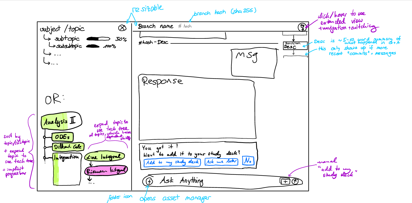
Given a vague idea and a handful of features we wanted to implement, early work on this prototype involved deciding on a features list and display designs which incorporated these features. To this end, we made digital drawings and sent them around so everyone could add notes and drawings as suggestions. This strategy made it easy and quick to build on previous ideas and communicated ideas in a very visual way that enabled easy translation to digital tools because everyone was aware of the shared goal.
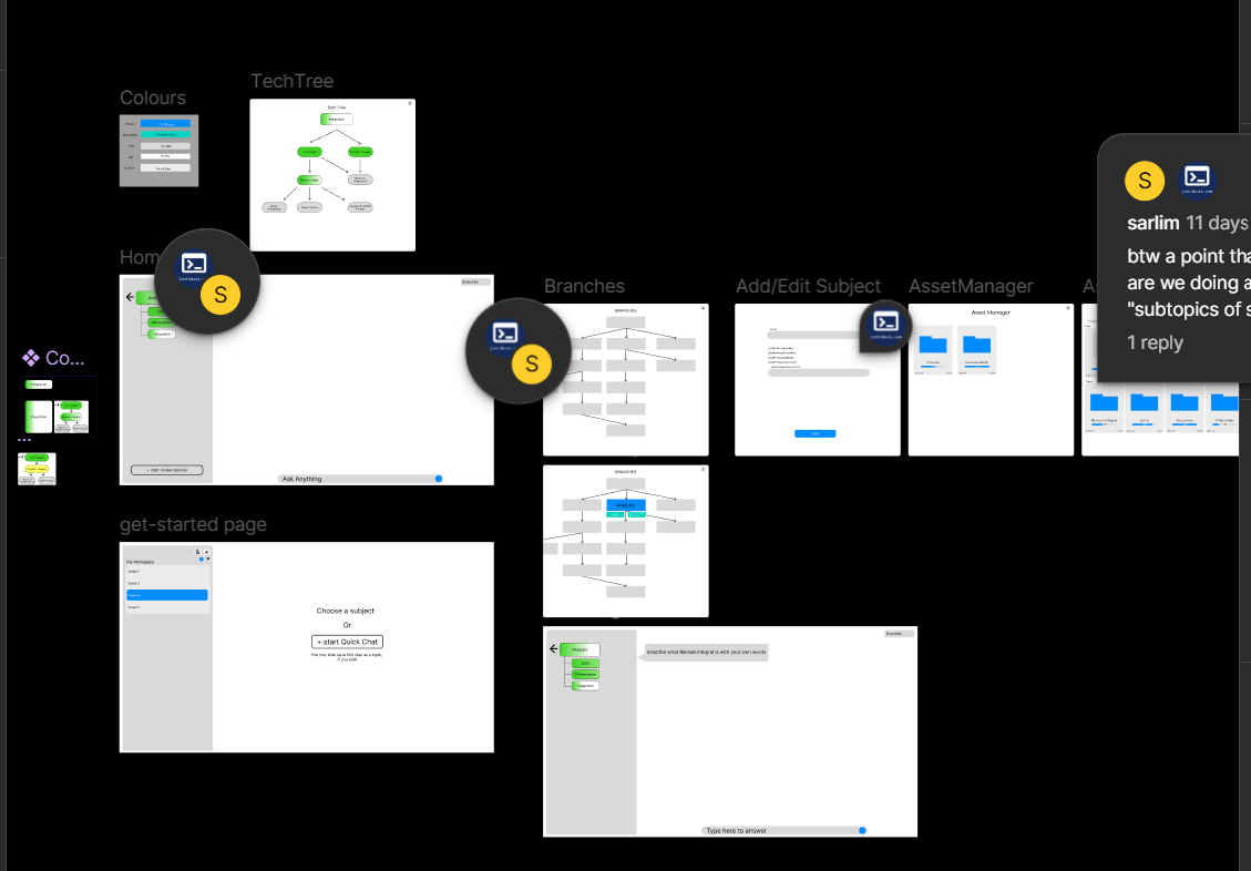
We started the initial prototyping on Figma, but after around 10 hours of cumulative investment encountered some bugs that prevented us from achieving our then- interaction goals (see video). Adding to growing frustrations with other elements of the platform, we decided to switch to webdev after careful consideration and explicit consent from all team members. This decision was helped in part by the prospect that a webapp would be much more flexible to changes following the peer review and that we could reuse many code blocks for the final product. In addition, the experienced web developer in our team offered a private "intro to webdev" session and was in general very generous and encouraging with feedback and assistance. At the beginning of this undertaking, there was some concerns surrounding our experienced web developer contributing much more to the project than the others, but we agreed to measure contribution by time, rather than output. We also distributed tasks by their difficulty and this, in addition to good communication and transparency, allowed everyone to feel comfortable and valued. At this point in time, we are not yet able to say if our work "paid off" in terms of carrying over into further product development. However, all team members claim to be happy with our switch in hindsight, as the level of interaction of our prototype is much higher than it would usually have been and we learned very useful skills in webdev.
Concerning our interaction design, we had quite a number (possibly too high a number) features we wanted to incorporate. This included a tech tree (skill graph), flashcards, progress bar, knowledge and context library, chat branches, file views and search functions. This was challenging in terms of workload, balancing discoverability with simplicity, and harmonizing interaction design. In particular, the volume of features meant that every additional design element had to consider incorporating numerous features, some of which may or may not be the most appropriate choice.
A specific example of this is our sidebar, which was initially supposed to display a list of subtopics with implicit progress bars. Following multiple changes of different features, the sidebar was removed and re-added to the design many times. It was at a point in our process when the design included no sidebar but 4 different buttons for various popups that we realized we could harmonize most features under a retractable sidebar, similar to VSCode. This greatly simplified further feature additions and will allow us to benefit from existing user intuition in working with sidebars.
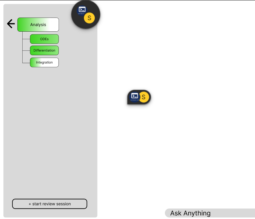
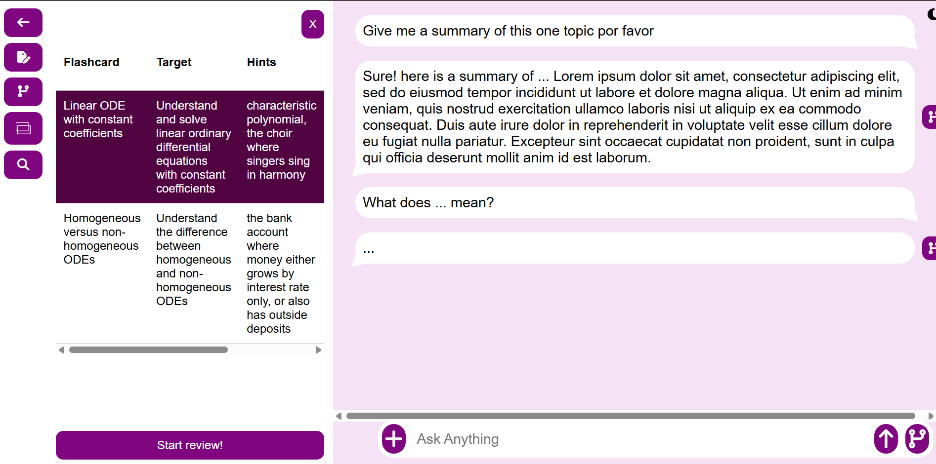
Since we have so many features, the peer testing will give us valuable insight into whether the sidebar enables discoverability of these features and aid navigation without feeling overwhelming. In addition, a point of user interaction concern was that our tech tree feature and our chat branch feature were conceptually very similar. We attempted to distinguish them by placing the tech tree in the sidebar together with the "user features" and the branches next to the chat bubbles and text input field with the "chat features". This in particular is something we need to explicitly test in our peer review. Eventually, we did leave out some features due to practicality reasons and looking back, this likely was a good idea, since it allowed us to focus on improving our most relevant features. In the future we would probably choose fewer features from the beginning.
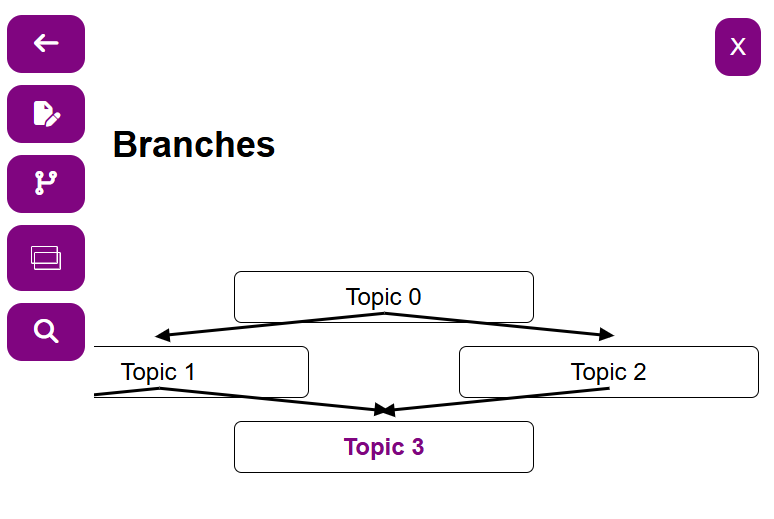
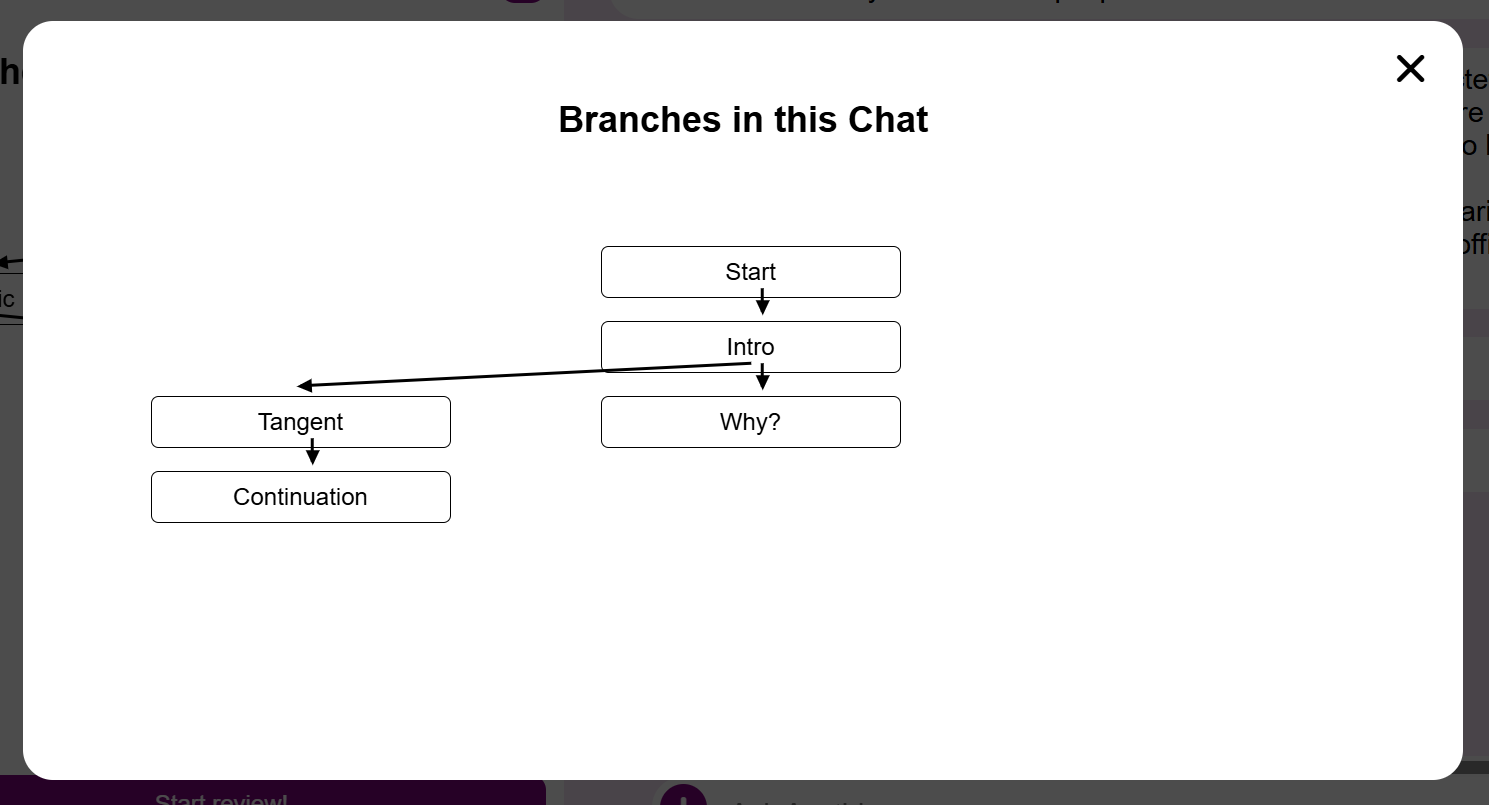
Overall, we were surprised to discover that the prototyping phase naturally gave rise to user interaction design questions that we had formally encountered earlier in lectures. We learned a lot in terms of interaction design and workflow (and webdev!) and even got very ambitious in improving our prototype.
Peer Testing
Peer testing was quite straight forward, we approached another group and exchanged two members of our groups for them to do the peer-testing with the respectively other group.
The primary issues that arose during peer-testing was note-taking, as taking accurate notes is challenging if the note-taker has not done much live transcription yet. Further issues can be attributed to a lack of proper preparation for the peer-testing specifically, since none of us have previously done in-person testing of a very incomplete piece of software before, meaning that workflows would have needed to be meticulously planned, which we did not do in sufficient depth.
Peer testing could have been done completely inside the group, due to the way in which we built the prototypes, and we would have loved to do some internal testing prior to the peer-testing, had we had more time for completing the assignment.
We found a few problems related to intuitiveness of the interface in this way, primarily in prototype b, caused mainly by the usage of the same icon for three different operations.
In the future, we would not do peer-testing this early on, due to the lack of polish in the software that a longer development cycle could have uncovered easily, primarily because heuristic evaluation in our case uncovered most issues, plus some more, discovered in the peer-testing. Furthermore, experience in the field of UI and UX can much more easily avoid the obvious UI/UX issues that were highlighted in the peer-testing. Many of the issues highlighted in the peer-testing were already discovered prior to implementation by a group member with WebDev experience, but not highlighted to allow the other members of the group to take their own learnings and to have a more fair balance of contributions to the prototype.
Heuristic Evaluation
Heuristic Evaluation was quite straight forward, following the lecture notes and especially the guiding questions in the Workbook did help quite a bit. This is also something where experience with building user interfaces certainly helps and some experience is luckily present in our team, which allowed us to notice most of the issues that were also noticed in the peer-testing and some other ones that weren't brought to light there.
Success of our ideas
Many of our ideas, especially the ones for Prototype A, were highlighted as neat features. Prototype A focused on encouraging the user to study on their own, while Prototype B focused on making the workflows less of a hassle.
We attribute that difference in attention to the features to be primarily due to the features of Prototype B being rather "what the user would expect" and Prototype A having the unique features that prompt the user to enjoy working with the tool more because it feels more rewarding.
We also noticed some issues with the branches and tech tree features, which were the main features of Prototype B, that boil down to it not being clear enough from the prototype which boil down to it not being clear what the difference between them is. This is something that we were aware of during development of the prototype and is something that we planned to address with the hi-fi prototype, since implementing something that truly differs and accurately shows the difference is quite time consuming. We could however have done a better job with selecting icons and naming of the two to more clearly communicate that the two are in fact not the same, by picking more suitable examples and by correctly naming the "Tech Tree" view panel as such.